Time: 13:12
Weather: Sunny and temperate
Topic: Website ideas
When creating my own stuff I like to try to pull apart other things I like and see what makes them tick. This is a good practice for things like art and design where studying technical elements can help you understand why a piece works and how to incorporate those techniques into your own art. So that's what I'm going to do with some old Nintendo sites.
Open the images in a new tab to see the full screenshot.
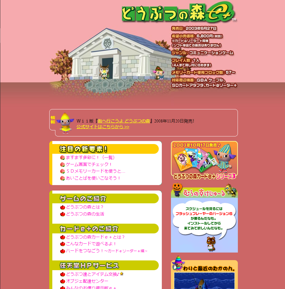
First up, どうぶつの森e+. This site was made for a much smaller monitor so I
viewed it in a window to get an idea of what it would have looked like. The index page is pretty simple. Just a bunch of tables and a two
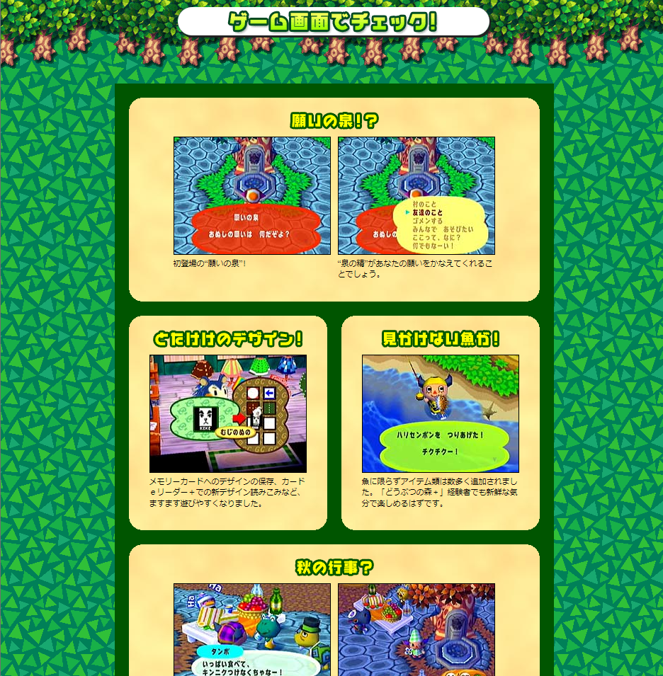
column layout. The second page which shows off some screenshots is pretty similar. It's one big table with two columns and a bit of simple
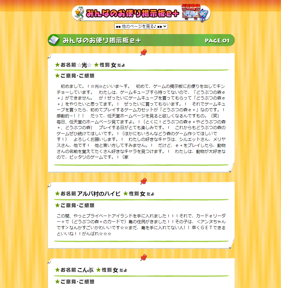
CSS and images to make it look nice. The third page is my favorite. An even simpler layout than the last two it shows off fan letters
that were sent in. The individual posts are styled to look like letters on a bulletin board with some simple images and tables. Overall,
the site is very uncomplicated both in terms of code and layout. Rounded corners, 1-2 columns, and images keeping with a specific color
themed off the seasons and places in town give it a pleasent, easy look that's fitting for Animal Crossing.
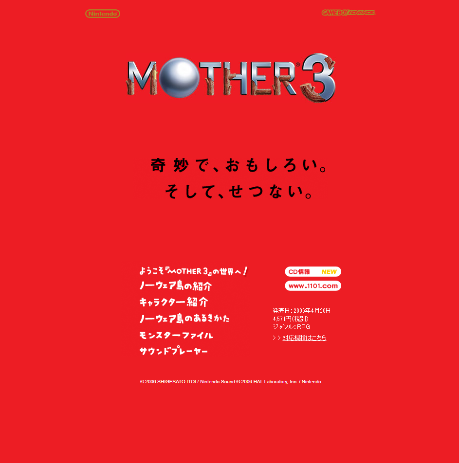
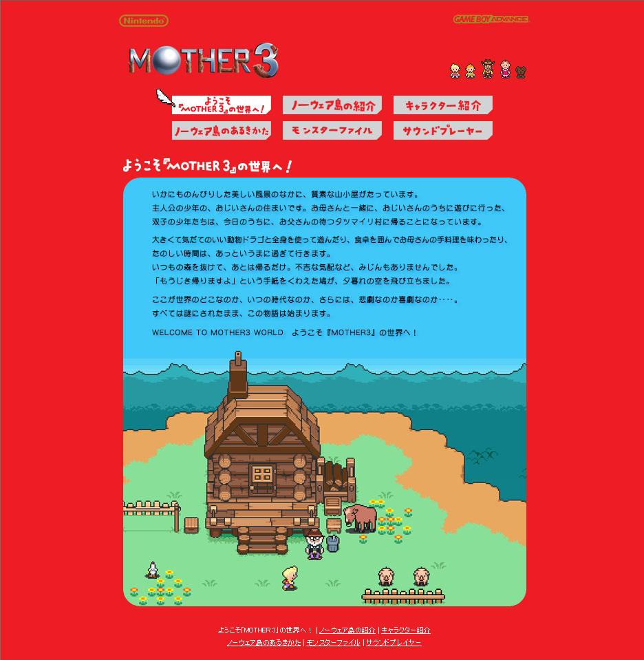
Now let's take a look at Mother 3. The index page is immediately very striking.
The code here is very simple but the layout is easy to read and stylish. In comparison to the どうぶつの森e+ site, this one is more cohesive.
Buttons on the top make it easy to jump between each page and the layout is kept essentially the same: one column with the content inside
contained by tables. Background images in the container are used to differentiate the pages from each other. Overall it's very clean, bright,
and I think speaks to design differences between 2000 and 2006.
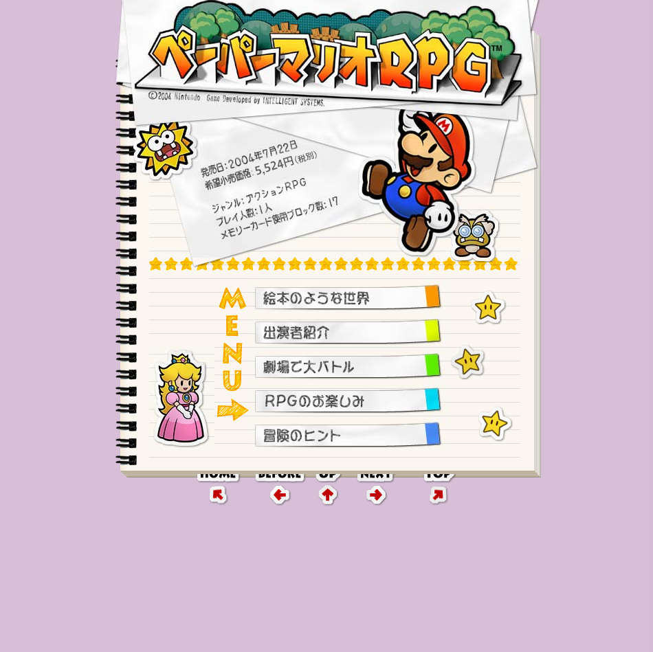
Finally, let's look at ペーパーマリオRPG. Once more, in terms of code it's a bunch of tables.
The whole site is styled to look like a notebook, fitting in with the game's theme. Links are scraps of paper and images and characters are stickers.
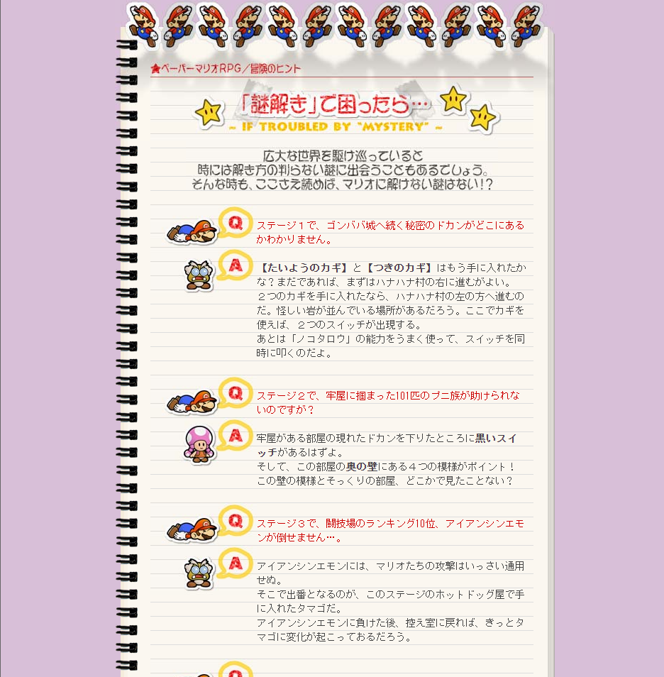
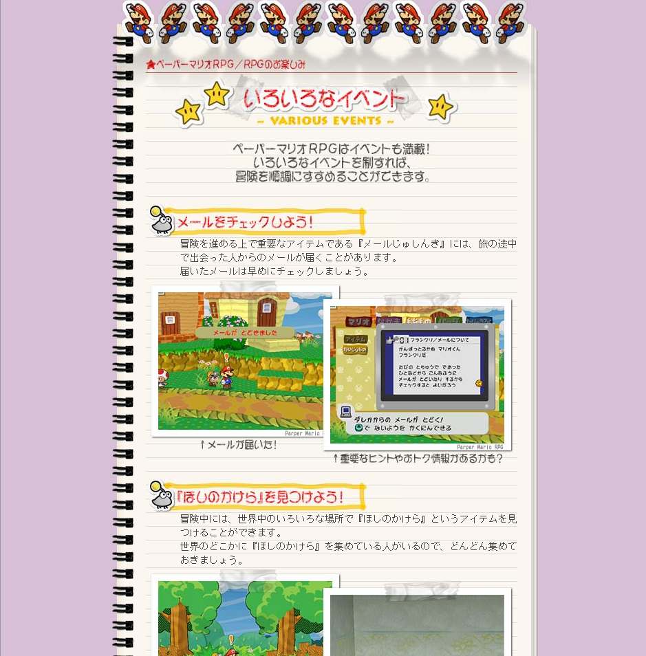
The second screenshot is a hint page. The font is styled so it fits over the notebook background. The final page shows off the style for screenshots,
images taped into a notebook.
If there's a key thing I'd take away from these old sites, it's their simplicity. They aren't especially complicated in terms of both code or appearence. What makes them unique is how they reflect the theme of their games. どうぶつの森e+ themes itself around the seasons and the various places around town like the bulletin board. Mother 3 has a clean look and high contrast colors that make it look striking. ペーパーマリオRPG themes itself entirely around a scrapbooking journal. The differences in fonts, backgrounds, and color make the sites unique even if the core of them is a bunch of tables.